Examples of Newsletter Formats
Conservation newsletter with clean layout for complex materials
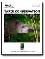 By Tapirs.org
Download pdf here
Good use of front page color picture of a lovely tapir. This scientific newsletter is well-organized and readable. Good example of a newsletter with a lot to say using pictures, charts and graphs. Nonetheless, it is not cluttered. It uses simple headers for categories. However, you can see one problem with readability with this newsletter on pages 10 and 11. Note that the page 10 story continues to page 11 where the story picks up again in the first column under the photo. This could be a reading flow problem, since the article might just as well pick up on the second column at the top of the page. In printed material, pages 10 and 11 would be side by side so this could be justified. But as a general rule, the article should pick up at the top left of the page. This flow problem could have been solve by moving the top left picture to the right.

Organizational newsletter with superb use of color
inSIGHT By Macular Degeneration Center
See PDF here
Lovely four-color, 8-page format uses a good, well-written headline on the cover and uses it effectively in color.Observe that the colors extend all the way to the edge of the paper. This is called a 'bleed.' On paper, the printer actually trims the paper so that their are no margins. It is relativel expensive in print, but no extra cost in a pdf. Note the lovely use of color column backgrounds that bump together on pages 7 and 8. The signature colors of the newsletter -- a green and a blue -- are nicely chosen, since some colors (like red) do not look well when when screened. Red, for example, becomes pink. This is a high-design newsletter that leaves sufficient space for content.
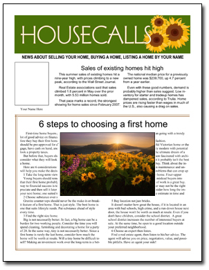 Real estate newsletter with graphics and articles
Learn more about HOUSECALLS by PagesMag.com
See PDF here
This newsletter, called Housecalls, is produced by PagesMag.com for our customers. It comes to subscribers as you see here, completely filled in. Our subscribers then use it as a starting point for their own newsletter (changing whatever they wish and adding their own articles and art) or they use it mainly as-is. It is a good example of an attractive design that is nonetheless accessible to the non-designer. The block layout inside makes plugging in new articles easy, while allowing room for individual creativity.
Click here to see more newsletter samples
Back to the beginning of the newsletter samples pages
See also: How to name your newsletter
CONTENT FOR NEWSLETTERS FROM PagesMag.com

Try a sample FREE with no obligation